
Brand identity and UI created for the "Dreamusic' online music consulting platform.
The brief for this project was to create a brand identity that could resonate with many different demographics and musicians of different styles, but still have the young audience as the main target, as they would be more likely to search for an outside professional opinion on their music.
As a musician myself, I really enjoyed being part of this project.Thinking back in 2010 this was a platform that was ahead of its time, bridging the way between aspiring bands/musicians, and music producers and established artists.
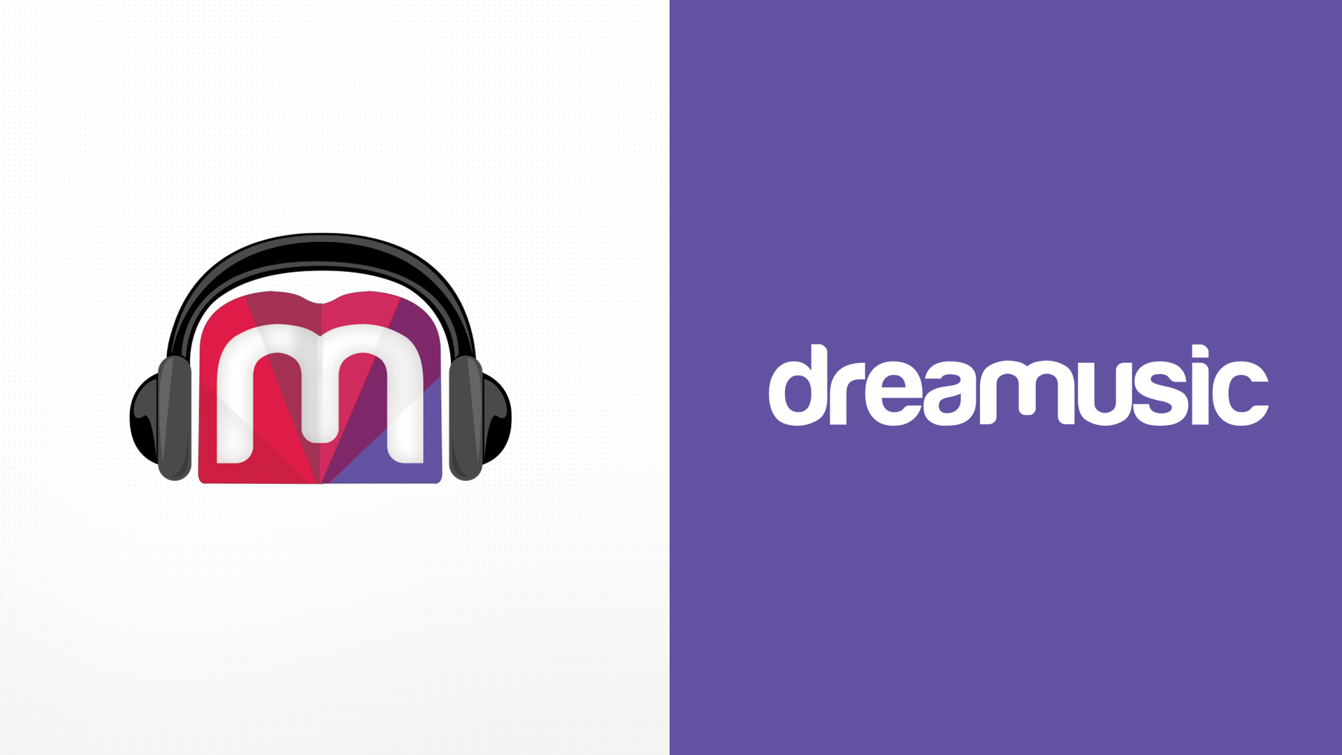
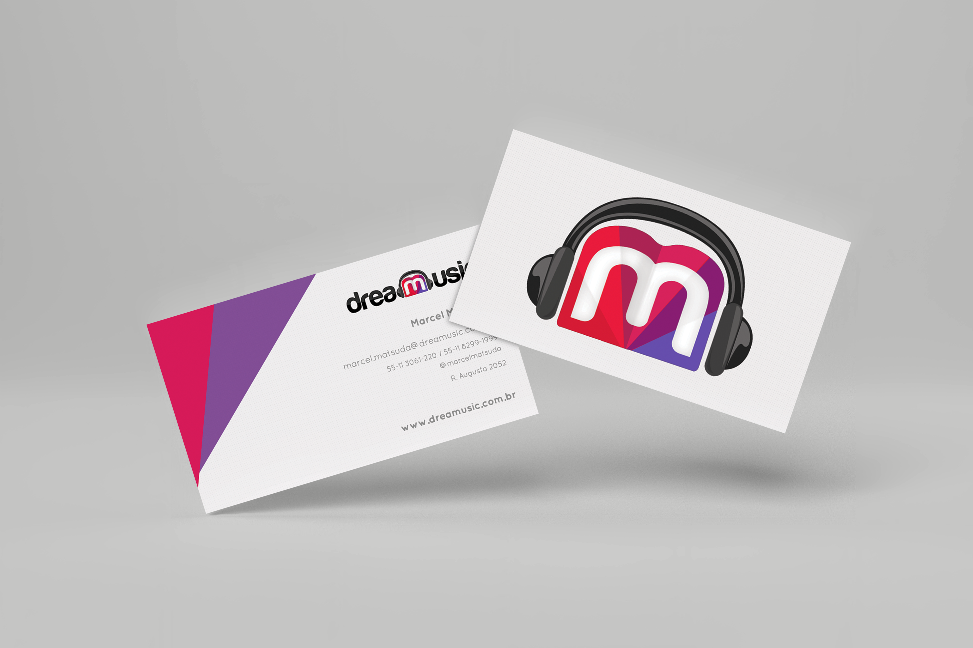
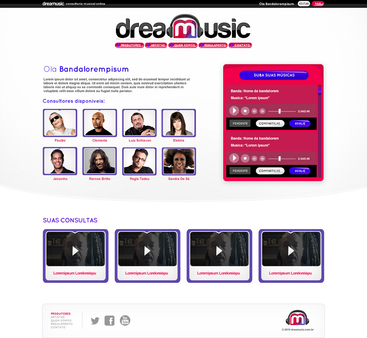
My colour palette choice of magenta to purple hue reflected the youth and diverse direction. I utilised the 'Harabara' font as the main typography, to give a futuristic and a tech touch to the identity. The icon which was incorporated into the logo, utilising the letter 'M' on top a flat colour origami background and headphones, was used as a centre piece to encompass the main concept of the user's music being heard from a wide range of consultants.
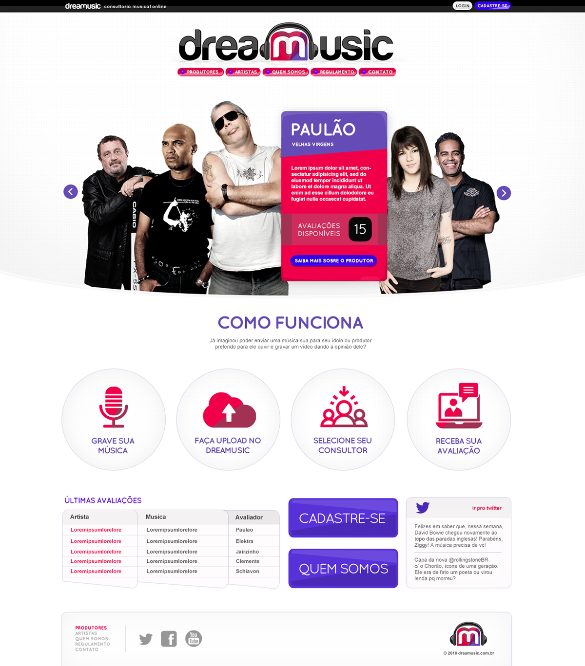
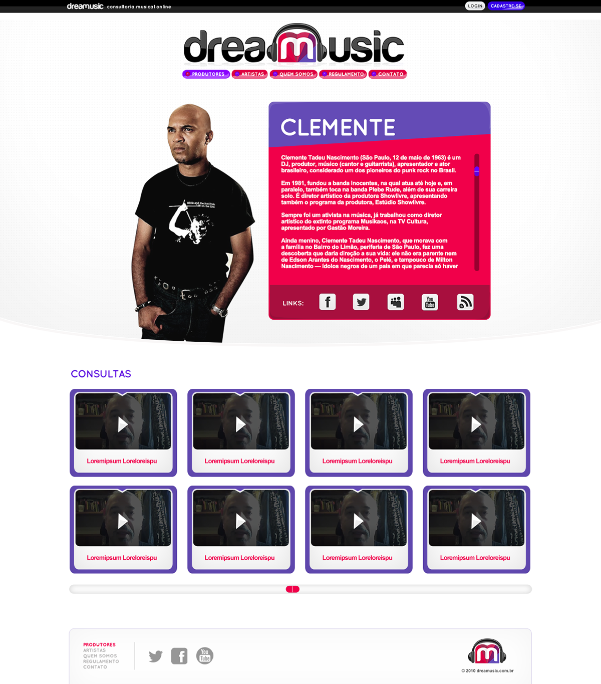
For the UI, I decided to go into a clean direction, as our branding was already very colourful, it was necessary to balance out the visual.
The homepage structure counted with a main carousel as the header to showcase the biggest and most known musicians/producers with a rollover that explained the consultant's background and how many valuations were available for him at our platform until the end the month, a row explaining step by step the platform consulting process and a last row with a valuation section, that would showcase the consultants video responses side by side with a 'Register" and "About' button, and Twitter feed.
2010 - São Paulo - Brazil
Agency: Fri.to
Art Direction and graphic design: Marcio Vincoletto
Agency: Fri.to
Art Direction and graphic design: Marcio Vincoletto